Lightweight Grid Columns
Easily add desktop, tablet and mobile friendly columns to your content using an easy to use shortcode.
The facts
- Rating
- 4.9★ from 42
- Active installs
- 10k+
- Price
- Free
- Last updated
- 14 Mar 2019
- Added
- May 2015
- Requires WP
- 4.5
- Tested up to
- WP 5.1.24
- Downloads
- 121,896
Our analysis
AI-assistedLightweight Grid Columns is a WordPress plugin designed to help you create responsive grid layouts for your content. After installation, you can easily specify the widths for desktop, tablet, and mobile views and insert your content using shortcodes. The plugin utilises the Unsemantic Framework for its grid functionality.
This plugin is suitable for users looking to enhance their website's layout without extensive coding knowledge. It offers features that cater to beginners and those focused on speed and performance.
Best for: This plugin suits beginners and those wanting to create responsive layouts without coding.
What it does well
- ✓Easy to use with a TinyMCE toolbar icon
- ✓Customisable widths for desktop, tablet, and mobile
- ✓Supports custom classes and inline styles
- ✓Utilises the Unsemantic Framework
- ✓Equal height columns feature
Where it falls short
- •Limited information on additional features or support
- •Last updated in March 2019
Verdict
Lightweight Grid Columns provides a straightforward way to create responsive grids. However, its last update was in 2019, which may raise concerns about ongoing support.
From the developer
Tom's own description of Lightweight Grid Columns, lightly tidied.
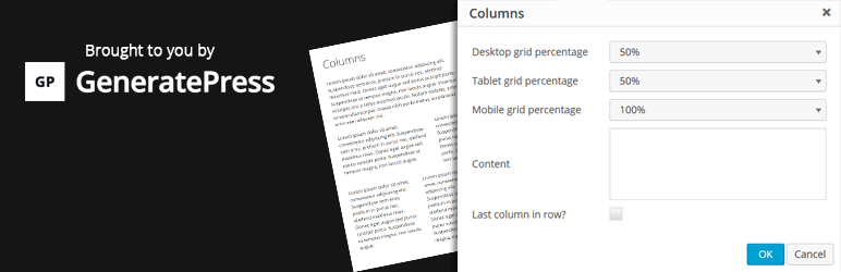
Lightweight Grid Columns are super easy to use! Install and activate the plugin, then look for the columns icon within your TinyMCE toolbar (see screenshots).
Specify your desired desktop, tablet and mobile widths of the columns, add your content and then insert your shortcode into your content.
Lightweight Grid Columns uses the awesome Unsemantic Framework: (http://unsemantic.com/)
Check out GeneratePress, our awesome WordPress theme! (https://wordpress.org/themes/generatepress)
Features include:
- Desktop grid width
- Tablet grid width
- Mobile grid width
- Add custom classes
- Add custom inline styles
- Equal height columns