Make Tables Responsive
Automatically makes the HTML tables in your posts and pages responsive (mobile-friendly).
The facts
- Rating
- 5★ from 34
- Active installs
- 6k+
- Price
- Free
- Last updated
- 26 May 2026
- Added
- Nov 2017
- Requires WP
- 3.5
- Tested up to
- WP 7.0.4
- Requires PHP
- 5.3.6
- Downloads
- 64,697
Our analysis
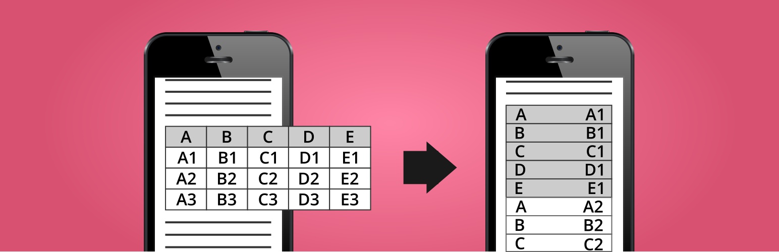
AI-assistedMake Tables Responsive is a WordPress plugin that automatically adjusts HTML tables in your posts, pages, and widgets to be mobile-friendly. It reformats tables for small screens into a two-column layout, displaying column names in one column and corresponding data in another.
This plugin is suitable for users who want to enhance the readability of tables on mobile devices without altering the original content. It offers options to customise the appearance and behaviour of the tables, making it a practical choice for content creators managing various types of data presentations.
Best for: This plugin is best for WordPress users who frequently use tables in their content and need them to display well on mobile devices.
What it does well
- ✓Automatically makes tables responsive
- ✓Does not alter original post/page content
- ✓Changes can be easily reversed by deactivating the plugin
- ✓No jQuery or JavaScript required on the front-end
Where it falls short
- •Requires the first row to contain column names
- •Does not work with merged cells
- •Skips tables nested within other tables
- •Strips HTML code from column names in multi-row tables
Verdict
Make Tables Responsive provides a straightforward solution for creating mobile-friendly tables, though it has limitations regarding table structures and formatting.
From the developer
Nikolay Nikolov's own description of Make Tables Responsive, lightly tidied.
Automatically makes the HTML tables in your WordPress posts, pages, and widgets responsive (mobile-friendly). Devices with a small screen will see the tables in a new layout with two columns. In the first column will be the data from the first row (the column names), and in the second column will be the data from the other rows.
WordPress Plugin Demo
https://nikolaydev.com/demo-of-make-tables-responsive/
HTML and CSS Demo for Non-WordPress Sites
https://nikolaydev.com/make-tables-responsive-html-and-css-example/
Features
- Affect post/page content, excerpts, category descriptions, and text/HTML widgets
- Choose affected screen size
- Choose the cell background and border color for even and odd rows
- Disable for tables by HTML class or ID
- Disable or enable only for posts and pages by ID
Pros 🙂
- Fully automatic
- Does not change the actual post/page content in the database
- Easily reverse changes by deactivating the plugin
- No jQuery or JavaScript on the front-end
Cons 🙁
- The first row must contain the column names
- Skips tables with merged cells
- Skips posts/pages with tables inside tables
- Skips multi-row tables when only some columns use “th” tags
- In multi-row tables, HTML code is stripped from the cells with the column names, when displayed in the responsive version (as the left column)