Join millions who empower their websites with ElementsKit Elementor Addons. Get templates, & 100+ widgets...
Free
1M+ installs 4.9★ (2,036)
WordPress Mobile Menu Builder plugin is specially designed for mobiles. It is easy to use, customizable, and is highly flexible.

Mobile Menu Builder for WordPress is a plugin designed specifically for enhancing mobile navigation on websites. It provides a customizable and responsive menu that simplifies user interaction on mobile devices, allowing up to four main menu options to be displayed. The plugin is aimed at users who want to improve the mobile experience of their site without affecting loading times.
The plugin allows for easy modifications of menu texts, icons, and styles to match your website's branding. You can choose the placement of the menu bar, either at the bottom or top of the screen, and toggle user scroll animations for a more dynamic interface. This makes it suitable for anyone looking to create a tailored mobile navigation experience.
Best for: This plugin suits website owners looking to enhance mobile navigation for their visitors.
What it does well
Where it falls short
Mobile Menu Builder for WordPress offers a straightforward solution for improving mobile navigation. While it provides several customization options, its beta status may require caution for some users.
Jeffrey Carandang's own description of Mobile Menu Builder for WordPress, lightly tidied.
WordPress Mobile Menu Builder plugin is specially designed for mobiles. It is easy to use, customizable, and is highly flexible. It allows you to create a responsive menu that will boost the mobile user experience in your website through providing a simplified mobile navigation experience.
Note that this plugin is currently on beta. Thanks!
WordPress Mobile Menu Builder allows users to easily navigate your website without compromising the loading time. Up to four main menu options can be set to simplify the mobile navigation of this responsive menu. Compatibility is not an issue since this WordPress mobile menu is designed to fit perfectly to any mobile screen dimension.
With this WordPress menu, you can work on a predesigned mobile menu theme and modify it according to your design preference. You can change the font, icon, and background styles and colors to perfectly match your website’s brand. This is applicable to any WordPress theme. Thus, plugin compatibility issue is never a problem.
WordPress Mobile Menu Builder is particularly designed to perfectly match the interface of any mobile phone. This provides a better user experience since it is exclusively designed for mobile.
Easily set the menu’s texts and icons based on the menu options that you want to feature in your site. You can choose to highlight important portions of your blog such as Home, Blog, Contact details, and main website menu. With this responsive menu, you have the complete control to choose whatever you want to display as menus depending on your website’s need.
Since you have the full control over the styling options, it will be easier for you to match the mobile menu design based on your website’s brand and style. You can easily modify the menu bar’s design to make it complementary to your website’s design and layout.
The menu bar’s default position is at the bottom of the screen to make it easier for the user’s thumb to reach the menu options. But you can also place the menu bar at the top position if you want to mimic the placement of menu in desktop view.
You have the option to fix the menu bar or turn on the user scroll animation. Turning the user scroll animation on lets you hide and show the menu bar upon scrolling. This will help increase the screen space and maximize the user’s mobile view.
Other plugins for site navigation.
Join millions who empower their websites with ElementsKit Elementor Addons. Get templates, & 100+ widgets...

Elementor Carousel, Mega Menu, Posts List/Slider, WooCommerce Widgets, Display Conditions, AI Abilities, Prema...
Elementor templates, Header footer builder, Elementor Post Grid, Woocommerce Grid builder, Slider, Forms, Gall...

Adds breadcrumb navigation showing the visitor's path to their current location.
Add icons to WordPress navigation menus easily — pick from Font Awesome, Dashicons, image icons & more. St...
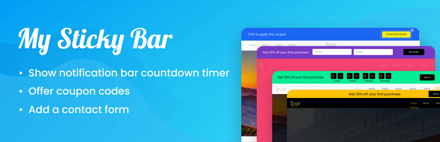
Create a welcome notification bar for your website. Also, My Sticky Bar plugin can make your menu or header st...