Progress Bar
A simple progress bar shortcode that can be styled with CSS
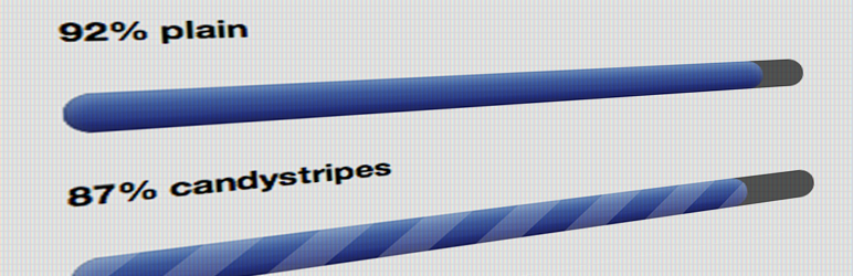
The facts
- Rating
- 5★ from 24
- Active installs
- 1k+
- Price
- Free
- Last updated
- 5 May 2025
- Added
- Feb 2012
- Requires WP
- 2.8
- Tested up to
- WP 6.7.7
- Downloads
- 70,044
Our analysis
AI-assistedProgress Bar is a WordPress plugin that creates a CSS3 progress bar that can be styled with custom CSS. You can use a simple shortcode to display the progress bar in posts or pages, where you specify the progress percentage or fraction, and even dollar amounts for fundraising goals.
The plugin supports custom colours and gradients, and is designed to be lightweight and cross-browser compatible. It is suitable for users who want to visually represent progress on their site, such as for projects, fundraising, or any other measurable goal.
Best for: This plugin is best for users looking to visually display progress on their WordPress site.
What it does well
- ✓Creates a CSS3 progress bar
- ✓Supports custom colours and gradients
- ✓Uses simple shortcodes for easy implementation
- ✓Cross-browser compatible
- ✓Allows for various progress formats, including percentages and dollar amounts
Where it falls short
- •Limited information on advanced styling options
- •No built-in templates or designs beyond basic functionality
Verdict
Progress Bar provides a straightforward solution for adding progress indicators to your site. It is a useful tool for anyone needing to showcase progress visually.
From the developer
Chris Reynolds's own description of Progress Bar, lightly tidied.
This plugin does one thing: it creates a simple (but nice-looking) CSS3 progress bar that you can style with your own CSS and use wherever you want with a simple shortcode. Now with support for custom colors and gradients.
To add a progress bar to a post or a page, simply use this shortcode:
[wppb progress=50]
where “50” in the example above is a progress bar that is 50% complete. Simple, lightweight, cross-browser compatible (degrades nicely for browsers that don\’t support CSS3).
For more examples and full descriptions of all the available options, click on the options tab.
For demos of each of the options, go here: https://progressbar.jazzsequence.com
Options
This page describes all the available parameters for the shortcode. These can be used in any combination. The only required parameter is progress. All parameters are case-sensitive (e.g. “progress” will work but “Progress” will not).
progress (required)
This determines how full the progress bar will be. Progress can be in 2 forms, either a number (0-100), in which case it will be interpreted as a percentage, or as a fraction (e.g. 25/100). Since 1.1, you can also use dollar signs (e.g. $63/$180), for example to create a fundraising progress bar. If using dollar signs, you only need to add a dollar sign to one or the other of the two values (e.g. 63/$180 or $63/180) — the plugin will output either option the same ($63/$180). Your progress can go over, too (e.g. 150/100 or 123%), but your mileage may vary for the display. It’s not recommended to use this with the fullwidth option, for example, because your progress will spill outside of your main body container.
Examples
[wppb progress=50] A progress bar that is 50% complete

[wppb progress="50/100"] A progress bar that is 50/100 complete

[wppb progress="$45/$50"] A dollar value progress bar that is $45/$50 complete

[wppb progress=110] A progress bar that has gone over 100%

[wppb progress=150/100] A progress bar that has exceeded its goal

[wppb progress=$125/100] A fundraising-style progress bar that has exceeded the goal
option
This adds one of several supported options to the progress bar. For those that know CSS, new “options” can be added simply by adding new styles to your style.css. See the Frequently Asked Questions page for more information on creating new CSS classes. Options can be combined by wrapping them in quotes in the shortcode. The progress bar will naturally have an inner shadow applied to it. The flat option was added to remove the shadow and display a “flat” color, best when used in conjunction with the color parameter.
Supported values: candystripe, animated-candystripe, red, orange, green, yellow, flat
Examples