WPThumbs
Themes Plugins By purpose By industry Best-of lists Fix it guides
Free Plugin by wowDevs v1.2.1

Responsive Visibility

Show or hide any Gutenberg block by device, custom breakpoint, or condition — login, user role, post type & more. No CSS, no code.
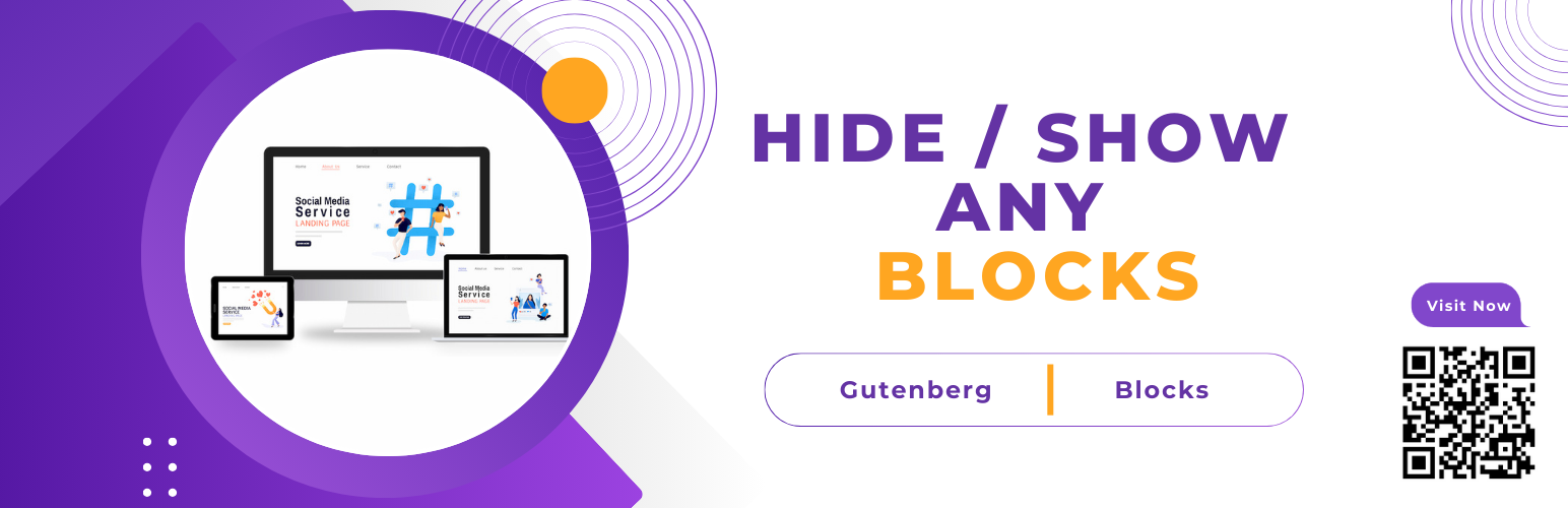
Responsive Visibility

The facts

Rating
4.5★ from 2
Active installs
100+
Price
Free
Last updated
7 Jul 2026
Added
Sep 2024
Requires WP
6.2
Tested up to
WP 7.0.4
Requires PHP
7.2
Downloads
2,265

Our analysis

AI-assisted

Responsive Visibility is a WordPress plugin that allows you to control the visibility of Gutenberg blocks based on device type and custom conditions. You can specify which screen sizes a block should appear on, using CSS media queries without needing to write custom CSS or modify your theme. This functionality is particularly useful for optimising content display for different devices, such as hiding large images on mobile to improve load times.

The plugin supports unlimited custom breakpoints, enabling you to tailor visibility settings to your specific layout needs. It integrates seamlessly with the Gutenberg editor, allowing you to manage visibility settings directly within the block settings. This plugin is suitable for users looking to enhance their site's responsiveness and tailor content based on user roles or login status.

Best for: This plugin is best for WordPress users who want to manage block visibility effectively across different devices and user conditions.

What it does well

  • Allows hiding/showing blocks by device type
  • Unlimited custom breakpoints for tailored visibility
  • No custom CSS or theme edits required
  • Seamless integration with Gutenberg editor
  • Cache-friendly design using CSS classes

Where it falls short

  • Limited information on user feedback and community support

Verdict

Responsive Visibility provides a straightforward solution for controlling block visibility in Gutenberg, making it a practical choice for those focused on responsive design.

From the developer

wowDevs's own description of Responsive Visibility, lightly tidied.

Responsive Visibility adds block visibility controls to every Gutenberg block. You choose which screen sizes a block shows on, and the plugin hides it on the rest with CSS media queries. There is no custom CSS to write and nothing to configure in your theme. To hide a block on mobile but keep it on desktop, open the block settings in the editor sidebar and switch the device off.

Most visibility plugins give you three fixed sizes. Responsive Visibility lets you define your own custom breakpoints instead, so you can add a widescreen rule for large monitors, a small-phone rule, or whatever your layout needs, and name each one. You manage them on a single settings page, the way Elementor handles breakpoints.

A few things people use it for: hiding a large hero image on phones to cut load time, showing a different call to action on desktop, or keeping a sidebar widget off small screens. Any block becomes a conditional block without a shortcode or a line of code.

For a walkthrough, watch this tutorial:

How It Works (3 Steps)

  1. Edit any block in the Gutenberg editor and open the Responsive Visibility panel in the sidebar.
  2. Pick the devices to hide it on — mobile, tablet, desktop, or any custom breakpoint you defined.
  3. Save. The block is hidden on exactly those screens — no custom CSS, no theme edits, no shortcodes.

Why Responsive Visibility?

  • Unlimited custom breakpoints — not just mobile/tablet/desktop. Define any number of named device ranges and the plugin generates the matching CSS media queries automatically.
  • Cache-friendly — visibility uses CSS classes and media queries, so every visitor gets the same HTML. It works with any caching plugin and updates live as the screen resizes.
  • Works with any theme — block themes or classic themes, with no template edits and no dependencies.
  • Backward compatible — blocks hidden with earlier versions keep working after an update, and your saved breakpoints are not lost.
  • Built for Gutenberg — controls live in the native block Inspector, right where you already edit.

Key Features

  • Hide or show blocks by device (desktop, tablet, mobile, and any custom breakpoint)
  • Visibility Conditions — show or hide blocks by login status, user role, specific user or post, post type, page type, URL query param, or shortcode, with All/Any logic
  • Unlimited custom breakpoints — add, rename, reorder, and set pixel widths from Settings → Responsive Visibility
  • Dynamic CSS generation — pixel values come from your saved breakpoints, never hardcoded
  • Cache-safe responsive design — CSS-based hiding that survives full-page caching
  • Per-block control — settings are applied per block, not per page
  • Seamless Gutenberg integration with native WordPress blocks and most third-party blocks
  • Improve page experience by hiding unnecessary or heavy elements on smaller screens

Visibility Conditions — Show or Hide Blocks by More Than Device

Visibility Conditions let you hide or show a block based on the visitor, the page, or the current request URL. Add one or more conditions to a block, choose whether all of them or any of them must match, and decide whether a match shows the block or hides it. Conditions run on the server, so hidden content is removed before the page is sent.

  • Login status — show member-only blocks to logged-in users, or a sign-up call-to-action only to logged-out visitors.
  • User role — show or hide blocks by user role: administrator, editor, author, subscriber, customer, or any custom role.
  • Specific user — personalize a block for one exact user by ID.
  • Specific post or page — show a block only on a chosen post or page.
  • Post type — target posts, pages, WooCommerce products, or any custom post type (single view or archive).
  • Page type — show on the front page, blog, single posts, archives, search results, or the 404 page.
  • URL Query Param — show or hide blocks by request data like preview, utm_source=google, or utm_source IN [google, yahoo].
  • Shortcode — gate a block on any custom PHP logic using a shortcode — a flexible, developer-friendly escape hatch.

You can use conditions and device rules together on the same block. Login and role conditions work with caching plugins as long as logged-in visitors get an uncached page, which is the default in most caching setups.

Ideal For

  • Content creators who want to hide large or secondary blocks on phones and tablets.
  • Designers building responsive Gutenberg layouts without writing one-off CSS.
  • Site owners tailoring what each device sees to boost engagement and speed.
  • Membership & WooCommerce sites showing content by login status and user role — members, customers, and subscribers see exactly what’s meant for them.
  • Agencies and developers who need simple, reliable block visibility and conditional content on client sites.

Read the full description on the official page →

Tagged as

Alternatives

Other plugins for extending a page builder.

Essential Addons for Elementor

Elementor addon offering 120+ widgets and templates — Elementor Gallery, Slider, Form, Post Grid, Menu, Accord...
Free 1M+ installs 4.9★ (4,111)
ElementsKit Elementor Addons

Join millions who empower their websites with ElementsKit Elementor Addons. Get templates, & 100+ widgets...
Free 1M+ installs 4.9★ (2,036)
Ultimate Addons for Elementor

Elementor addons with 18+ free widgets, Header & Footer Builder, WooCommerce widgets & templates. Trus...

Free 2M+ installs 4.9★ (2,525)
Premium Addons for Elementor

Elementor Carousel, Mega Menu, Posts List/Slider, WooCommerce Widgets, Display Conditions, AI Abilities, Prema...
Free 600k+ installs 4.9★ (1,677)
Royal Addons for Elementor

Elementor templates, Header footer builder, Elementor Post Grid, Woocommerce Grid builder, Slider, Forms, Gall...

Free 600k+ installs 4.8★ (611)
Disable Gutenberg

Disable Gutenberg Block Editor and restore the Classic Editor and original Edit Post screen (TinyMCE, meta box...

Free 500k+ installs 5★ (733)