TZM Responsive Block Controls
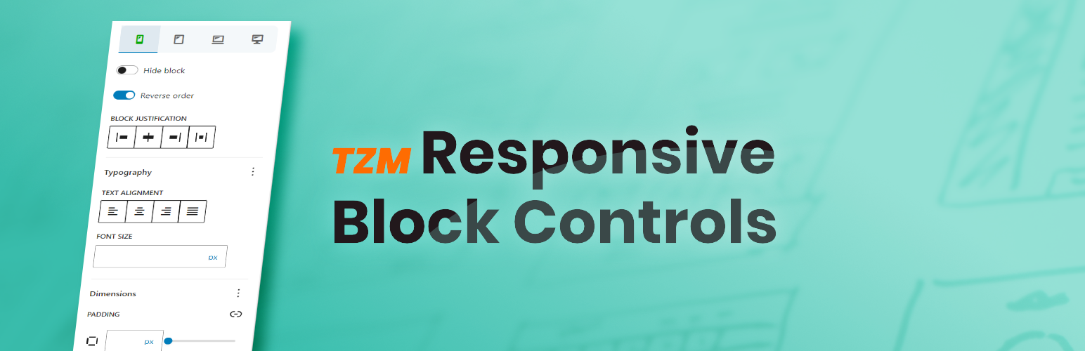
TZM Responsive Block Controls lets you customize blocks for different screen sizes. Control visibility, alignment, font size, spacing, and much more.
The facts
- Rating
- 5★ from 1
- Active installs
- 100+
- Price
- Free
- Last updated
- 20 May 2026
- Added
- Oct 2024
- Requires WP
- 6.4
- Tested up to
- WP 7.0.4
- Downloads
- 2,518
Our analysis
AI-assistedTZM Responsive Block Controls is a WordPress plugin designed to enhance the Gutenberg Block Editor by providing responsive controls for block settings. It allows you to customize how blocks appear on different devices without the need for complex workarounds or custom CSS.
The plugin includes features such as hiding blocks on specific devices, adjusting block widths, reversing block direction, and fine-tuning focal points for media. It is suitable for users who want to create tailored layouts that look good across various screen sizes.
Best for: This plugin is best for WordPress users looking to improve the responsiveness of their block layouts.
What it does well
- ✓Enhances Gutenberg Block Editor with responsive controls
- ✓Allows hiding blocks on specific devices
- ✓Customizes block widths and heights for different screens
- ✓Adjusts font sizes and spacing for optimal readability
- ✓Source code available on GitHub for community involvement
Where it falls short
- •Limited information on user feedback and usage statistics
Verdict
TZM Responsive Block Controls provides useful tools for enhancing the visual appeal of block designs across devices. It may be particularly beneficial for those focused on responsive web design.
From the developer
Jakob Wiens's own description of TZM Responsive Block Controls, lightly tidied.
While the (Gutenberg) Block Editor has brought a lot of amazing and powerful tools to web design, it still falls short in one crucial aspect: Responsive controls
TZM Responsive Block Controls is here to fill the gap!
This plugin enhances the Block Editor by adding a dedicated Responsive controls panel right inside your block’s settings tab.
The provided options allow you to customize how your blocks appear on different devices. No more need for complicated workarounds or custom CSS!
- Hide Blocks: Easily hide blocks on specific devices to create tailored, clutter-free layouts.
- Adjust Block Widths: Set custom block widths per device, ensuring your content looks great on all screen sizes.
- Reverse Direction: Reverse the direction/order of blocks (like ‘Columns’ or ‘Row’ blocks) for optimized layouts.
- Justify Blocks: Ensure fluid layouts by adjusting block justification across different devices.
- Optimize Focal Points: Fine-tune focal points for background images and other media on different screen sizes.
- Align Media and Text: Control horizontal alignment of media and text for consistent appearance across devices.
- Font Size Adjustments: Adjust font sizes for each device to ensure optimal readability and maintain visual hierarchy.
- Control Padding and Margins: Set custom padding and margins for each device to achieve perfect spacing.
- Adjust Block Gaps: Define custom spacing between blocks to maintain flow and balance on all device types.
- Customize Block Heights: Set different block heights across devices to maintain consistent layouts.
- Refine Border Radius: Customize the border-radius to achieve consistent rounded corners across different devices.
With such an extensive and exclusive feature set, TZM Responsive Block Controls provides everything you need to create stunning and visually appealing designs across different devices.
Source Code
The source code for TZM Responsive Block Controls is now available on GitHub!
Follow the development, report issues, and get involved in improving the plugin. We welcome contributions, feedback, and feature requests from the community.