
Comprehensive image optimization with WebP, AVIF, Lazy Load, and more. Optimize images automatically for Faste...
Free
1M+ installs 4.8★ (1,838)
WP Fluid Images replaces the fixed width and height attributes so your images resize in a fluid or responsive design.

WP Fluid Images is a WordPress plugin designed to enhance image handling in posts and pages by removing fixed width and height attributes from image tags. This is particularly useful for themes that utilise responsive design, as it prevents images from exceeding the width of their container.
The plugin operates by applying a max-width rule of 100% to images and recalculating their width as a percentage based on the parent container. It adjusts images inserted through the visual editor and those within galleries, ensuring they fit appropriately within the layout.
Best for: This plugin suits users who have WordPress sites with responsive design needs and require flexible image handling.
What it does well
Where it falls short
WP Fluid Images offers a straightforward solution for managing images in responsive WordPress themes, but its age and directory score suggest caution regarding compatibility.
ramseyp's own description of WP Fluid Images, lightly tidied.
WP Fluid Images runs when you insert an image into a Post or Page. It removes the fixed width and height attributes from the image tag. If you insert an image from the image uploader, by default, a width and height attribute is inserted into the image tag with fixed pixel values. This plugin prevents this from happening, because this can be problematic if your theme is built using responsive design methods. The plugin also adds a style tag near the end of the document that sets a max-width rule of 100%. This helps ensure that any image in a Post or Page won’t extend past the width of the Post or Page.
If you resize an image in the Visual Editor, a new width and height attribute get added to the image. WP Fluid Images loads a jQuery script that examines the closest parent div for image tags. It calculate the image’s width as a percentage of the width of that div, removes the width and height attributes, and adds a style attribute with a width value set to the calculated percentage.
An image that is part of a WordPress gallery will have it’s width attribute calculated as a percentage of its parent .gallery-icon element.
If you insert an image with a caption, instead of applying a style attribute with a width as a percentage to the image, the plugin will apply it to the .wp-caption div.
Other plugins for optimising images.
Comprehensive image optimization with WebP, AVIF, Lazy Load, and more. Optimize images automatically for Faste...

Compress and optimize images, enable lazy load, serve WebP & AVIF, and speed up your site with a global im...

Speed up your website by using our WebP & AVIF Converter. Optimize images and serve WebP and AVIF images i...
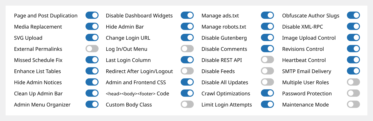
Duplicate post, post order, image resize, email via SMTP, admin menu editor, custom css / code, disable gutenb...
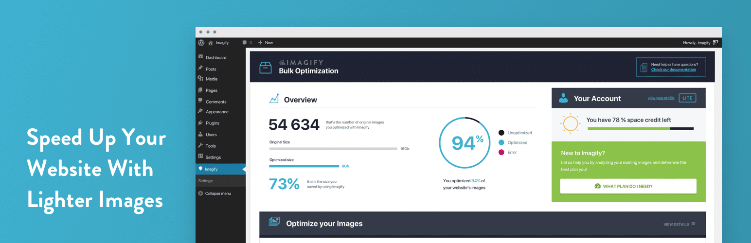
Image optimization in 1‑click: compress, resize & convert to WebP/AVIF – free up to 20MB/month. Enjoy the...

SpeedyCache is a WordPress cache plugin that helps you improve performance of your WordPress site by caching,...