
Autoptimize
92Autoptimize speeds up your website by optimizing JS, CSS, images (incl. lazy-load), HTML and Google Fonts, asy...
Free
800k+ installs 4.7★ (1,428)
Add icon, responsive spacing, typography, alignment, shadow, transform, transition, color, hover style to blocks. Lightweight, fast, and clean.
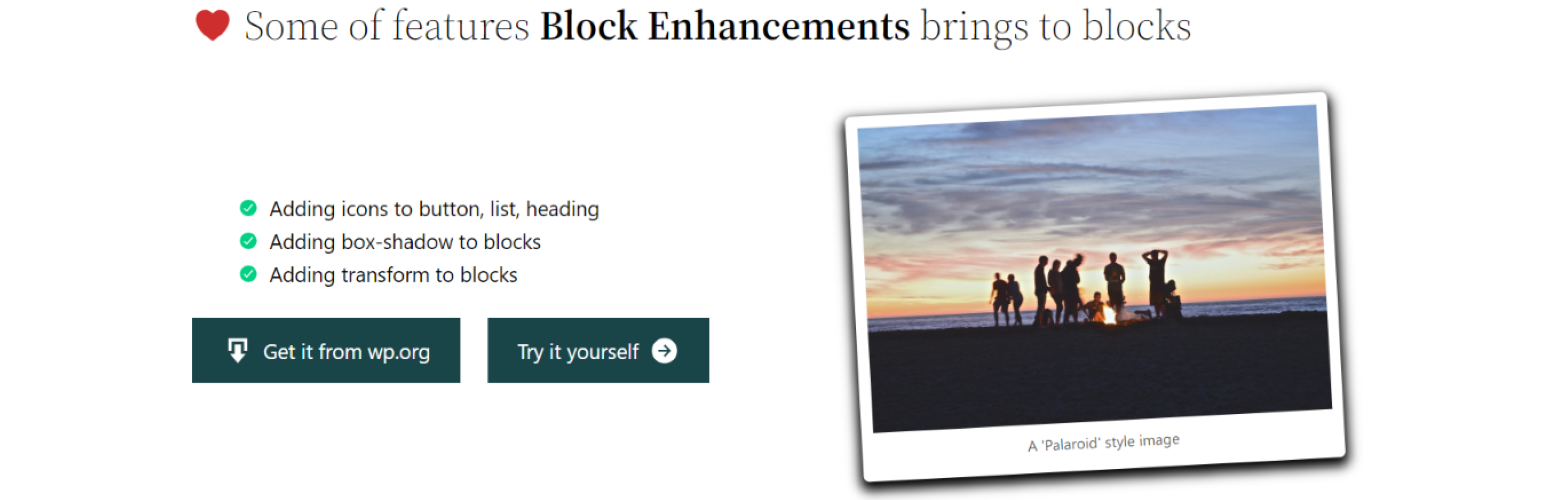
Block Enhancements is a WordPress plugin that adds design options to core Gutenberg blocks, enabling you to enhance existing blocks without relying on large custom block libraries. It allows for flexible styling adjustments that are responsive across devices, ensuring your site remains fast and clean. The plugin renders dynamic styles in the document head, and deactivating it removes all customized styles without leaving any remnants.
This plugin is suitable for users who want to customise their Gutenberg blocks with features like responsive typography, spacing adjustments, and hover effects. It works with all Gutenberg-ready themes, but may conflict with other plugins or themes that use similar CSS techniques for icons.
Best for: This plugin is best for WordPress users looking to enhance the design of their Gutenberg blocks without heavy custom libraries.
What it does well
Where it falls short
Block Enhancements provides a practical solution for customising Gutenberg blocks with responsive styling options. It is a useful tool for those wanting to improve the visual aspects of their site efficiently.
Phi Phan's own description of Block Enhancements, lightly tidied.
Block Enhancements adds powerful design options to core Gutenberg blocks, so you don’t need to install heavy custom block libraries.
It’s the easiest way to make your existing blocks more flexible and responsive while keeping your site fast and clean. All dynamic styles are rendered in the document head instead of inline styles. If you deactivate the plugin, all customized styles are removed, and no leftover styles will affect your site.
Unlike other similar plugins, this plugin is lightweight. It only loads what you need. You can enable or disable individual features per block type from the plugin’s settings page.
It works with all Gutenberg-ready themes, however, the with-icon feature uses the CSS pseudo ::before to add icons with the mask-image CSS property. It may conflict with other plugins or themes that use the same technique.
Responsive styles are applied per device mode: Desktop, Tablet, and Mobile. When you edit a style for a block for the first time, the current device mode becomes the source, and the other modes will automatically inherit those styles.
For example, if you set styles in Desktop mode first, Tablet and Mobile will inherit the Desktop styles by default. If you want different styles for Tablet or Mobile, switch to that mode and adjust the settings there. The same behavior applies if you start editing in Tablet or Mobile mode. Each device mode can be customized independently once it has been edited.
By default, the breakpoints are:
If your theme or another plugin uses different breakpoints, you can change the defaults using the following filter:
    apply_filters( 'block_enhancements_get_breakpoints', [
      'sm' => [
        'breakpoint' => '576px',
        'mediaQuery' => '',
      ],
      'md' => [
        'breakpoint' => '768px',
        'mediaQuery' => '@media (min-width: 768px){##CONTENT##}',
      ],
      'lg' => [
        'breakpoint' => '1024px',
        'mediaQuery' => '@media (min-width: 1024px){##CONTENT##}',
      ],
    ] );
This allows you to align responsive behavior with your theme’s breakpoint system.
Other plugins for typography control.
Autoptimize speeds up your website by optimizing JS, CSS, images (incl. lazy-load), HTML and Google Fonts, asy...
The #1 fonts plugin for WordPress. 1,400+ Google Fonts, Adobe Fonts and your own font files. Live preview, no...

Redux is a simple, truly extensible, and fully responsive options framework for WordPress themes and plugins....
The original Google Fonts self-hosting plugin. Automagically caches your fonts locally — no configuration (or...
SpeedyCache is a WordPress cache plugin that helps you improve performance of your WordPress site by caching,...
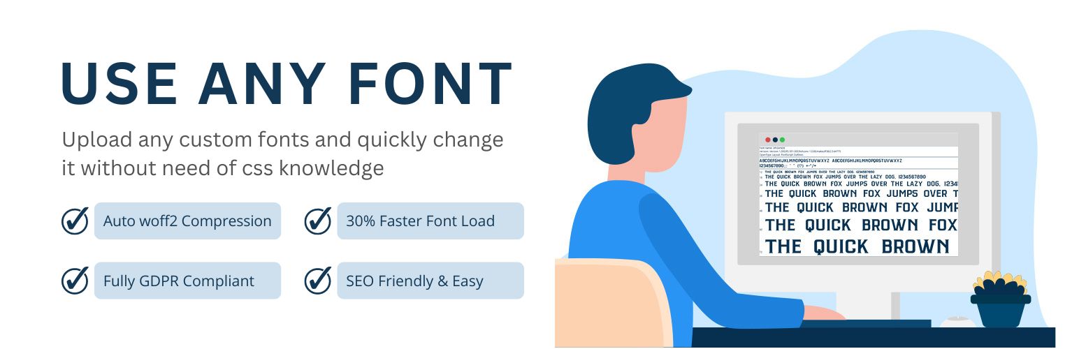
Upload custom fonts with custom font uploader. Auto converts to woff2 for better performance. Self-hosted, GDP...