Members
94The best WordPress membership and user role editor plugin. User Roles & Capabilities editor helps you rest...
Free
300k+ installs 4.9★ (1,274)
Transform any WordPress block into a fully responsive element with device-specific controls for mobile, tablet, and desktop optimization.
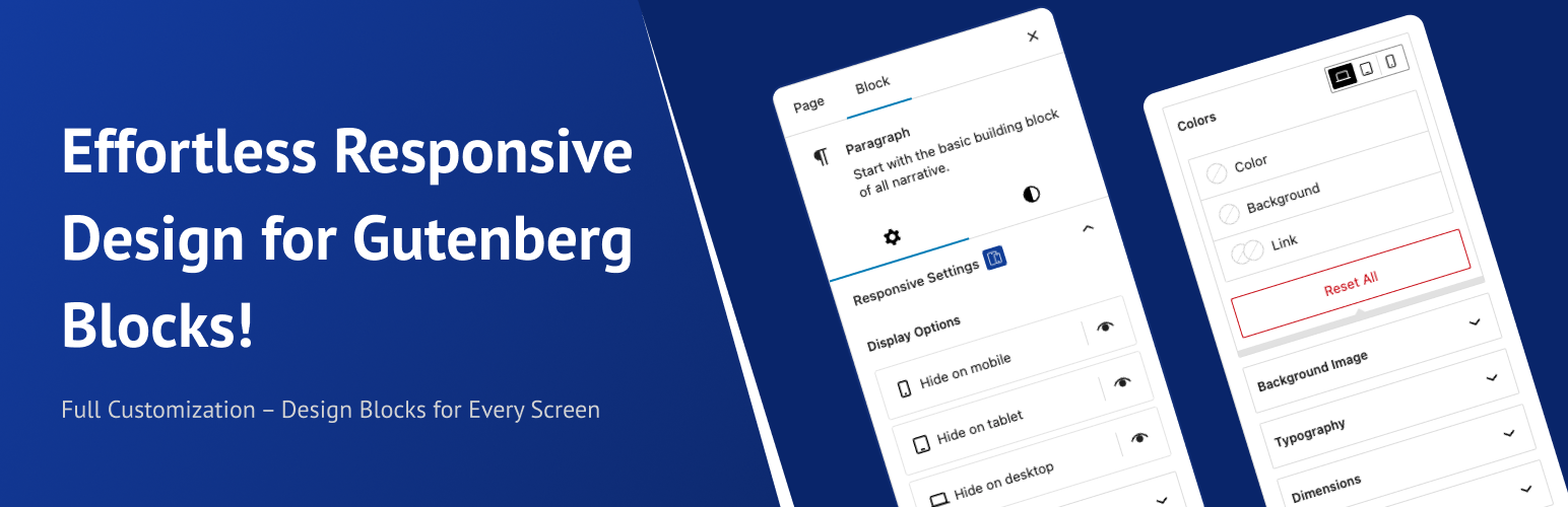
Block Responsive is a WordPress plugin designed to help you create mobile-friendly websites using Gutenberg blocks. It provides tools for managing how content displays across various devices, allowing for responsive layouts without requiring coding skills.
The plugin includes features such as device-specific styling options, alignment controls, and the ability to hide or show blocks on different devices. It is suitable for users looking to enhance the mobile experience of their websites and improve overall responsiveness.
Best for: This plugin suits website developers and designers focused on creating responsive layouts for mobile devices.
What it does well
Where it falls short
Block Responsive offers a comprehensive set of tools for managing responsive design in WordPress. It is a useful option for those looking to improve their site's mobile compatibility.
Sheikh Ashrafuzzman's own description of Block Responsive, lightly tidied.
Block Responsive is the ultimate WordPress plugin for creating mobile-friendly, responsive websites with Gutenberg blocks. This comprehensive responsive design tool gives you complete control over how your content appears across all devices, making it easy to build responsive layouts without any coding knowledge.
Perfect for creating mobile-responsive websites, this plugin automatically adds responsive breakpoints and device-specific styling options to every core WordPress block. Whether you’re optimizing for mobile SEO, improving tablet user experience, or fine-tuning desktop layouts, Block Responsive provides the responsive web design tools you need.
Hide/show blocks on specific devices (mobile, tablet, desktop)
Simple toggle controls with device-specific icons
Visual feedback for hidden blocks
Alignment Controls: Block alignment settings for different screen sizes
Colors Controls: Text color, background color, and link color with device-specific settings
Background Image Controls: Responsive background image settings
Typography Controls: Font size, line height, letter spacing, and text transform for each device
Dimensions Controls: Padding, margin, width, and height controls for responsive layouts
Border & Shadow Controls: Border radius, border width, and shadow effects per device
Manage the whole plugin from the new dashboard under Settings > Block Responsive:
Feel free to share them with me at hello@ashrafuzzaman.com. I’d love to hear your thoughts!
Other plugins for moving data.
The best WordPress membership and user role editor plugin. User Roles & Capabilities editor helps you rest...
Manage all your WordPress updates, including individual updates, automatic updates, logs, and loads more. This...

Redux is a simple, truly extensible, and fully responsive options framework for WordPress themes and plugins....

🌠 Shorten, brand, and track any URL on your own domain. Keep your links — and your data — where they belong....
Export WooCommerce orders to Excel, CSV, XML, JSON, PDF and HTML. Best free order export plugin for WooCommerc...
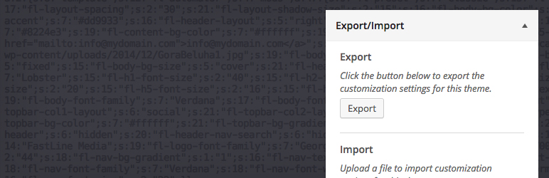
Easily export or import your WordPress customizer settings!