
Autoptimize
92Autoptimize speeds up your website by optimizing JS, CSS, images (incl. lazy-load), HTML and Google Fonts, asy...
Free
800k+ installs 4.7★ (1,428)
Create fluid typography & spacing presets natively in Elementor — no CSS clamp formulas, no breakpoints, just seamless responsive design.
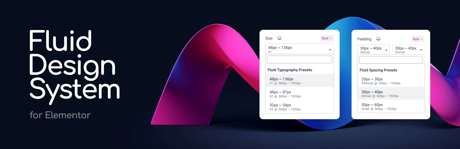
Fluid Design System for Elementor is a WordPress plugin that integrates fluid typography and spacing presets into Elementor's interface. It allows you to define minimum and maximum values for typography and spacing, enabling designs to scale automatically across different screen sizes without the need for manual adjustments at each breakpoint.
This plugin is suited for users who want to create responsive designs efficiently. It eliminates the need for repetitive styling across multiple breakpoints, making it easier to maintain consistent design and spacing throughout a site.
Best for: This plugin is best for web designers using Elementor who need to create responsive designs efficiently.
What it does well
Where it falls short
Fluid Design System for Elementor offers a practical solution for responsive design, simplifying the process of maintaining consistent styles across devices. It is a useful tool for Elementor users looking to enhance their design workflow.
Artem Semkin's own description of Fluid Design System for Elementor, lightly tidied.
Design once. Scale everywhere.
Fluid Design System for Elementor is a small yet powerful add-on that brings fluid typography and spacing presets directly into Elementor’s interface — helping you create fully responsive designs that scale naturally across every screen size, from tiny phones to ultra-wide desktops.
🎯 Think of it like color presets — but for padding, font sizes, and layout gaps.
With just a few clicks, you can:
– Define minimum and maximum values for typography or spacing.
– Apply those values using a new “fluid” unit inside any Elementor control.
– Watch your design scale smoothly—no coding or media queries required.
– Organize your presets into custom groups (e.g. “Border Radius”, “Thumbnail Sizes”) for better management.
Say goodbye to manually tweaking every breakpoint. Say hello to automatic, intelligent design scaling with organized preset management.
❓ What Does “Fluid” Mean?
Traditionally in Elementor, you need to set separate values for each breakpoint — for example, one font size for desktop, another for tablet, and another for mobile.
While this gives some control, it has two major downsides:
– 🧩 It’s rigid: You only define styles for specific screen widths, leaving awkward gaps in between where the design may not scale smoothly.
– ⏱️ It’s time-consuming: Updating styles across multiple breakpoints for every section and element becomes a repetitive, manual process.
💡 Fluid Design System solves this.
Instead of setting fixed values for each breakpoint, you define just two—a minimum and a maximum — and the plugin automatically generates a smooth scaling behavior in between. This means:
– One preset handles all screen sizes.
– You get consistent design and spacing across the entire site.
– You save time and reduce manual effort.
– You can organize presets into groups for different projects or design systems.
This plugin introduces Fluid Units, powered by CSS clamp() and custom presets, allowing your design to scale automatically across all screen sizes.
Here’s how it works in real scenarios:
Other plugins for typography control.
Autoptimize speeds up your website by optimizing JS, CSS, images (incl. lazy-load), HTML and Google Fonts, asy...

The #1 fonts plugin for WordPress. 1,400+ Google Fonts, Adobe Fonts and your own font files. Live preview, no...

Redux is a simple, truly extensible, and fully responsive options framework for WordPress themes and plugins....

The original Google Fonts self-hosting plugin. Automagically caches your fonts locally — no configuration (or...

SpeedyCache is a WordPress cache plugin that helps you improve performance of your WordPress site by caching,...
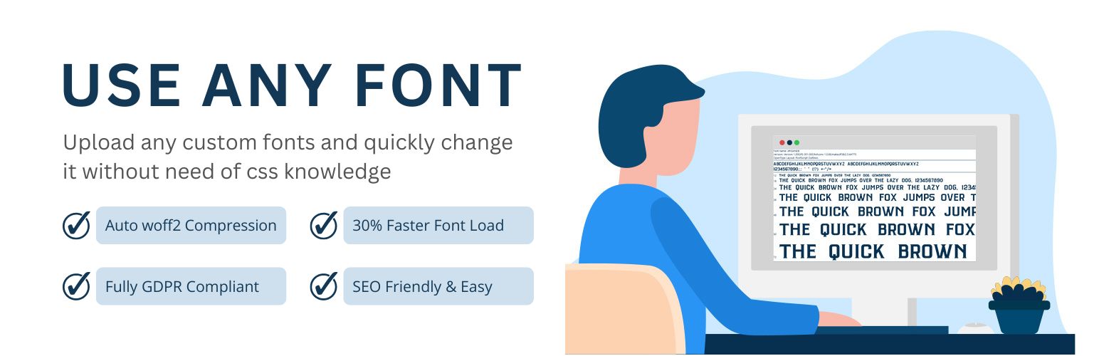
Upload custom fonts with custom font uploader. Auto converts to woff2 for better performance. Self-hosted, GDP...