Yoast SEO
98Real-time SEO guidance, schema, and AI built in. Help search engines and AI systems understand your content. A...
Free
10M+ installs 4.8★ (27,819)
Instant mobile view of website (pages, posts, products) for responsive web design on phone (+ dualscreen). This plugin also offers helpful tools on ea …
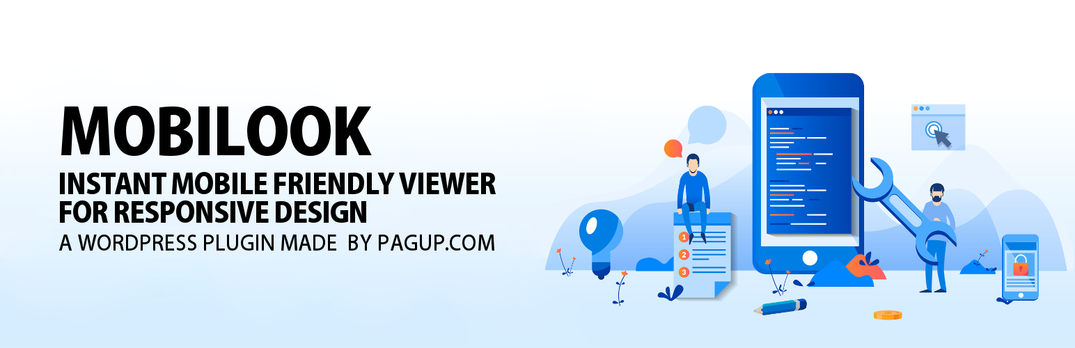
MOBILOOK is a WordPress plugin that allows you to test the mobile responsiveness of your website. It provides an instant preview of how your pages, articles, or products will appear on various mobile devices, helping ensure that your site meets mobile-friendly criteria. This is particularly useful for website owners who want to optimise their sites for the growing number of mobile users.
Once installed, MOBILOOK integrates into your WordPress editor, displaying a mobile rendering of your content directly below the editor. It supports various device formats, including popular models from Apple, Samsung, and Google, making it easier for you to check the mobile compatibility of your site without needing to switch devices.
Best for: Website owners looking to ensure their site is mobile-friendly.
What it does well
Where it falls short
MOBILOOK is a useful tool for testing mobile responsiveness, especially for those concerned about SEO and user experience on mobile devices.
Pagup's own description of MOBILOOK, lightly tidied.
In an era where mobile usage dominates internet traffic, it is crucial to have a mobile-friendly website. Ensuring your website meets mobile-friendly criteria is a key factor in online success, both for users and search engines.
What You Should Know:
Overview:
The MOBILOOK (Mobile View) plugin, an extension of Google DEVTOOL, allows you to instantly check the responsive design of your pages, articles, or products on mobile in various formats (Apple, Samsung, Google devices).
Once installed, MOBILOOK (Mobile View) is deployed on each of your pages. A section appears just below the WordPress Content Editor; once your content is published, it immediately shows you the mobile rendering based on the format you have defined.
There’s no longer a need to check what your site looks like on your mobile to see if it’s well suited to phones, tablets, and other media (responsive).
PRO Features
MOBILOOK PRO (Mobile View) offers several features:
Available Device Formats (Mobile View)
Why Is a Responsive Site Important for SEO?
Since April 2015, Google has officially rewarded mobile-friendly websites and penalized sites that are not mobile-friendly in its search rankings. A non-mobile-friendly site risks seeing its traffic drop significantly due to a decrease in its SEO ranking.
A responsive web design ensures that your site functions properly on all devices and screen sizes, offering an intuitive and satisfying user experience.
Explanation of the Tools:
Other plugins for search engine optimisation.
Real-time SEO guidance, schema, and AI built in. Help search engines and AI systems understand your content. A...
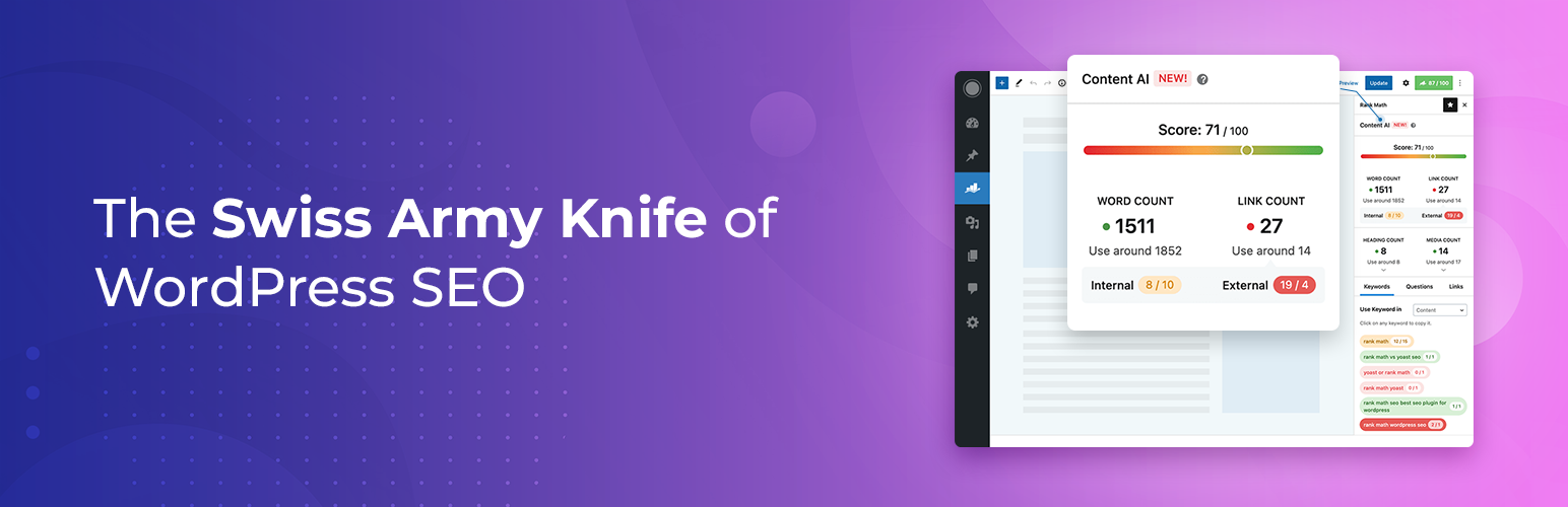
Grow your organic traffic and AI visibility with powerful SEO tools, XML sitemaps, Schema automation, and buil...

Translate WordPress with Google Translate multilanguage plugin using AI translation. Complete multilingual SEO...
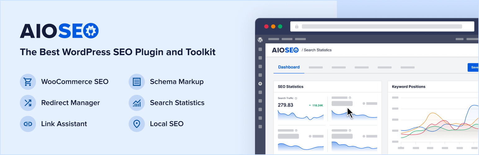
AIOSEO is the WordPress SEO plugin. Boost SEO rankings with AI SEO tools, schema, meta descriptions, XML sitem...

Generate multiple types of sitemaps to improve SEO and get your website indexed quickly.
WordPress SEO plugin with AI SEO metadata, schema, XML sitemap, redirections & Search Console. Privacy-fir...