Ad Inserter
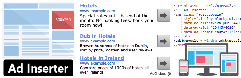
94Manage Google AdSense ads, banners, ad rotation, sticky widgets, AMP ads, ads.txt, tracking, header and footer...
Free
300k+ installs 4.9★ (2,428)
Your WordPress menu automatically becomes a touch-friendly dropdown on mobile devices.

Responsive Mobile Select Menu is a WordPress plugin designed to enhance mobile navigation by converting standard menus into touch-friendly dropdowns for mobile users. It operates without requiring any theme modifications, automatically detecting mobile devices and adapting the menu accordingly while keeping the desktop version unchanged.
This plugin is suitable for anyone looking to improve their site's mobile navigation experience without needing technical expertise. It is built with modern WordPress standards, ensuring accessibility and compatibility with all modern themes.
Best for: This plugin is ideal for website owners wanting to enhance mobile navigation without technical hassle.
What it does well
Where it falls short
Responsive Mobile Select Menu offers a straightforward solution for improving mobile navigation. Its accessibility features and ease of use make it a practical choice for many WordPress users.
Saskia Teichmann's own description of Responsive Mobile Select Menu, lightly tidied.
Key Benefits:
✅ Better mobile navigation
✅ No theme modifications needed
✅ Works with any WordPress menu
✅ Fully accessible
✅ Customizable breakpoint
How it works: The plugin detects when someone visits your site on a mobile device and automatically converts your menu into an easy-to-use dropdown. Desktop visitors see your normal menu unchanged.
Perfect for: Anyone who wants to improve their mobile site navigation without technical hassle.
Mobile Menu Made Simple
Your WordPress menu automatically becomes a touch-friendly dropdown on mobile devices.
Key Benefits:
✅ Better mobile navigation
✅ No theme modifications needed
✅ Works with any WordPress menu
✅ Fully accessible
✅ Customizable breakpoint
How it works: The plugin detects when someone visits your site on a mobile device and automatically converts your menu into an easy-to-use dropdown. Desktop visitors see your normal menu unchanged.
Perfect for: Anyone who wants to improve their mobile site navigation without technical hassle.
Technical note: This plugin uses WordPress’s native menu system and automatically detects screen size to show the appropriate menu format. It’s built with modern WordPress standards and includes full accessibility support.
Other plugins for mobile experience.
Manage Google AdSense ads, banners, ad rotation, sticky widgets, AMP ads, ads.txt, tracking, header and footer...
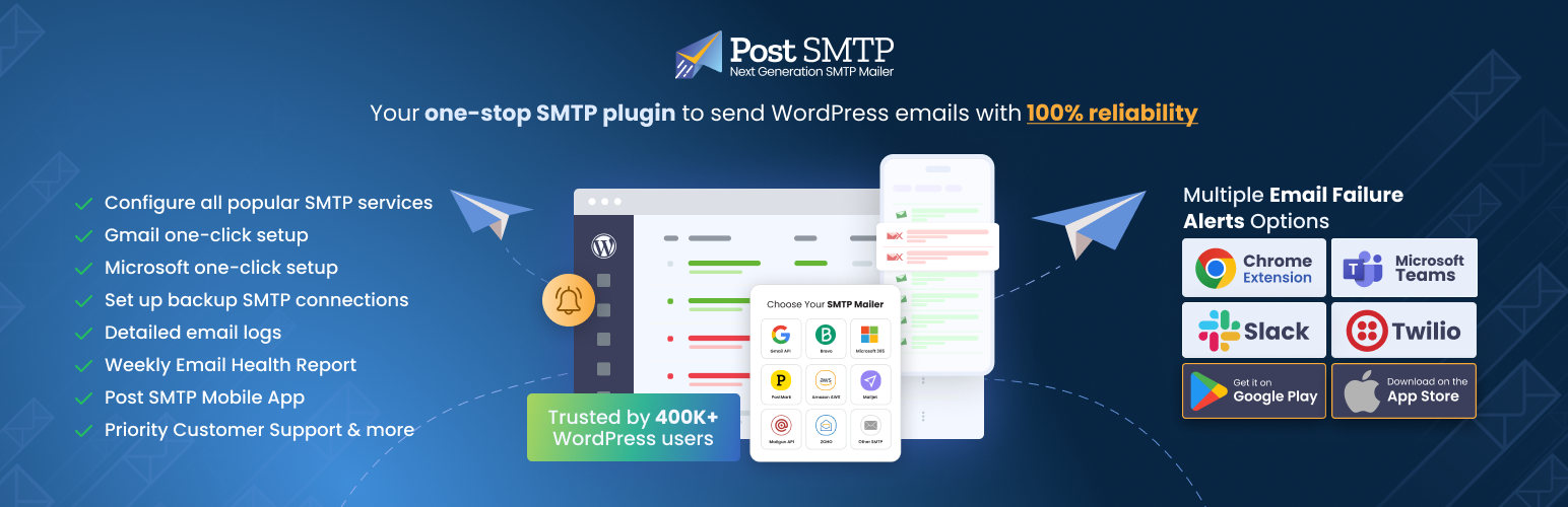
Improve WordPress email deliverability. Connect Gmail SMTP, Microsoft 365, Brevo, SendGrid, Mailgun, Zoho, Ama...

Seven free modules for Elementor: dark mode, container layouts, mobile menu, editorial text, style presets, JS...
AMP for WP is the most recommended AMP plugin by the community. Automatically add Accelerated Mobile Pages (Go...

Mobile menu & hamburger menu builder for WordPress. Create a responsive, customisable menu with 150+ optio...

SuperPWA helps you convert your WordPress website into a Progressive Web App instantly.