Ad Inserter
94Manage Google AdSense ads, banners, ad rotation, sticky widgets, AMP ads, ads.txt, tracking, header and footer...
Free
300k+ installs 4.9★ (2,428)
This plugin adds the option to use the SlickNav Responsive Mobile Menu in place of a regular menu at a designated size.
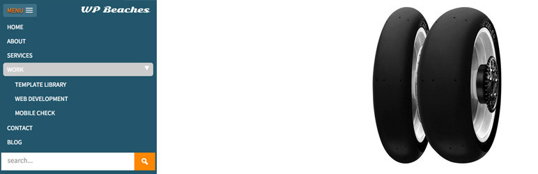
SlickNav Mobile Menu is a WordPress plugin that adds a responsive mobile menu to your site. It supports multi-level menus and is designed to be accessible and compatible across different browsers. You can customize various aspects of the menu, including the option to add a search field and a logo.
The plugin's settings can be accessed through the WordPress dashboard, allowing you to select the original menu to use and adjust various options like menu width and speed. It is suitable for users looking to enhance their site's mobile navigation experience.
Best for: This plugin is best for WordPress site owners wanting to improve mobile navigation.
What it does well
Where it falls short
SlickNav Mobile Menu provides essential functionality for mobile navigation, making it a useful tool for enhancing user experience on mobile devices.
neilgee's own description of SlickNav Mobile Menu, lightly tidied.
This plugin adds SlickNav Responsive Mobile Menu functionality to WordPress.
SlickNav Responsive Menu has multi level menu support.
Cross browser Compatible.
Keyboard Accessible.
Degrades gracefully without JavaScript.
Creates ARIA compliant menu.
Option to add a search field.
Option to add a logo.
Internationalized.
Advanced Filter.
Combine multiple menus.
The settings are found via the dashboard Settings > SlickNav Menu
Here you choose your Menu to be used as Mobile Menu – original has to already be on page
Maximum width for the menu to appear, default is 600px
Menu Label, MENU is default
Parent links, true or false, whether a parent link that has a submenu is clickable to a page
Show Child Links, false by default
Open/close Menu speed option
Fix Menu to Head, using position fixed to body tag
Option for branding logo opposite menu label – smaller works better such as 40px in height and up to 140px in width
Option to hide header with a ‘.site-header’ class when Slicknav Menu is visible
Option to add in a search field at the bottom of the menu
Search icon background color
Options to change the opening and closing symbols
Advanced filter to adjust Slicknav values – https://wpbeaches.com/slicknav-wordpress-filter-to-adjust-values/
Demo – http://wpbeaches.com (resize browser window to below 600px)
Please note that SlickNav jQuery plugin is the work of Josh Cope, he is not responsible for the working or support of this plugin.
Other plugins for mobile experience.
Manage Google AdSense ads, banners, ad rotation, sticky widgets, AMP ads, ads.txt, tracking, header and footer...

Improve WordPress email deliverability. Connect Gmail SMTP, Microsoft 365, Brevo, SendGrid, Mailgun, Zoho, Ama...

Seven free modules for Elementor: dark mode, container layouts, mobile menu, editorial text, style presets, JS...

AMP for WP is the most recommended AMP plugin by the community. Automatically add Accelerated Mobile Pages (Go...

Mobile menu & hamburger menu builder for WordPress. Create a responsive, customisable menu with 150+ optio...

SuperPWA helps you convert your WordPress website into a Progressive Web App instantly.